
Today, the Office of Management and Budget released new data pages for each of the priority areas of the President’s Management Agenda (PMA) — Workforce, Customer Experience, and Managing the Business of Government. These pages reflect two core PMA values: accountability and results.
To this end, these pages feature data visualizations for some of the key metrics the administration is monitoring within each priority area. To help the public both understand how PMA teams are assessing performance, the pages include context on the questions we’re trying to answer and why this data matters to the lives of the American public.
For example: one goal of Priority 3, Managing the Business of Government, is focused on creating a diverse and resilient federal marketplace by using category management principles to increase stewardship over federal spending. The data visualization shows data on cost avoidance, or the extent to which a program is delivering increased value for goods and services they acquire by paying less, using less, or obtaining more for the same cost. Agencies can use this data to measure and compare their cost avoidance to the Federal Government targets, so decision makers can identify where to prioritize efforts for improvement.
Data visualizations include:
- A comparison of customer experience quality between the government and different sectors such as retailers and health insurers (Priority 2 — Customer Experience)
- Hiring manager satisfaction scores (Priority 1 — Workforce)
- Number of federal hires in critical occupations such as acquisition and IT (Priority 1 — Workforce)
Below are further examples of data visualizations from each priority area:
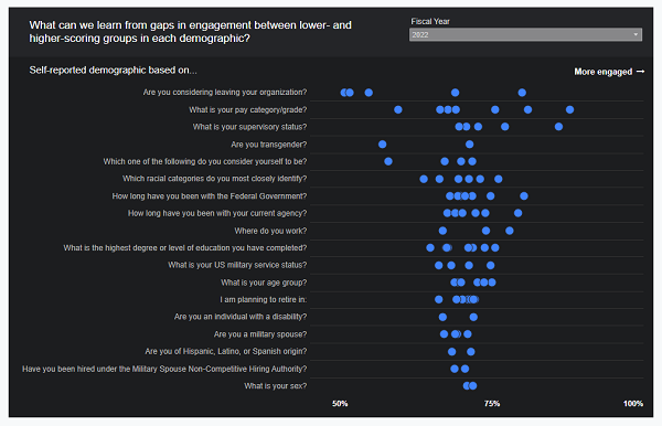
Priority 1 data visualization showing employee engagement index scores for FY 2022.
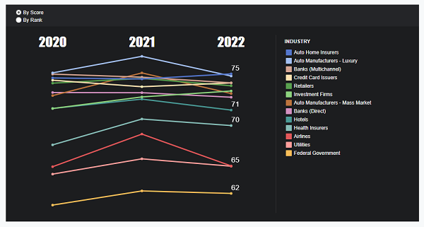
Priority 2 data visualization showing a ranking of customer experience quality by industry from 2020 to 2022.
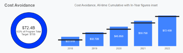
Priority 3 data visualization showing cost avoidance in dollars between 2018 and 2022.
To provide accountability and results, these new pages will be updated as data becomes available and we will use these pages to hold ourselves accountable for making, measuring, and communicating progress.
To view the new data visualizations, click on “Data” within any of the three PMA priority area pages.
Stay Informed
We invite you to follow along with us on Performance.gov, which will be updated quarterly with progress on agency and PMA priorities and strategies. For further information, we encourage you to follow our Twitter and LinkedIn, and to subscribe to our newsletter to receive updates in your inbox.